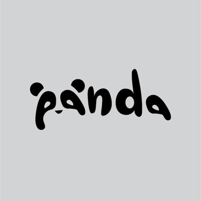
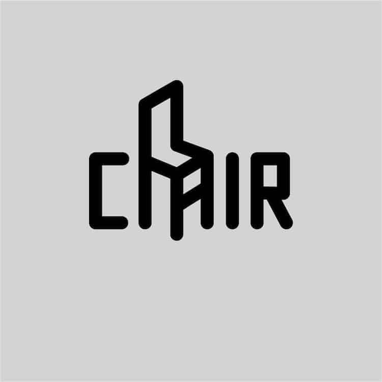
It took an entire year but after 365 days of daily designing, Daniel Carlmatz finally revealed his witty logo designs, mixing the image with the word itself. The visual wordplay turned ordinary everyday words into some not so ordinary designs. He subtly manipulated letterforms to create minimalistic yet ingenious outcomes, the simplicity and wittiness catering to the modern day audience. The logos are simple yet engaging, conveying their meaning in two ways, through the word itself and the image he stretches and contorts the word to create. He manages to capture the essences of the word with even the simplest of adjustments. He kept his base typefaces clean and simple, keeping the attention on his design rather than the type, along with keeping it contemporary. They also match up with his chosen word, using rounder and harder styles to fit. His designs make you think, turning typeface into an entire logo and design.