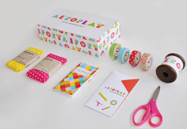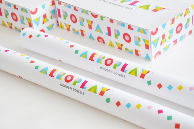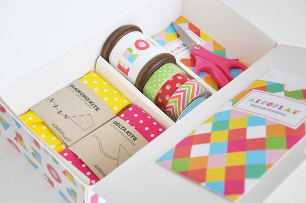
Toronto based graphic designer Lily Li designed the packaging for Aeroplay Kites, a kite DIY kit for kids. The product is aimed at children, which is clearly represented through the playful and vivid colours. The simple but bold patterns, matched with the happy colour scheme stand out against the white packaging giving such an eye-catching look, especially to a younger audience. The geometric shapes and colours of her typeface for the logo means it’s just as striking when doubled up as the pattern design for the packaging. It also sets the theme for the entire design of the products and packaging, the use of simple shapes, colours and the playful feel carries throughout, giving the entire range a complete and cohesive look. This also continues to hold the users attention and enjoyment when creating their kite, the tapes and fabrics, even the instructions remaining fun and vibrant. The fun and fresh designs revive the making of kites, bringing a new feeling of enjoyment to the otherwise sinking activity.